Ideally, you would be able to create one single banner for your brand and use it across all of your social platforms.
That one banner would fit on your website, YouTube, Facebook, and all the ones you use, and it would remain effective for years to come.
Unfortunately, that’s not the case. Although you can use the same brand colors, fonts and pretty much the same graphics for all your marketing channels, every social media platform has a different banner size.
YouTube isn’t the exception, so in this guide, I lay out all of the YouTube banner information, such as size, best practices, and which tools to use to create one, and if you need, you can use a free template I created to help you out.
Let’s dive into it.
Table of Contents
- YouTube Banner Size
- YouTube Banner Template Guidelines
- Free YouTube Banner Template
- Best Practices When Creating Your YouTube Banner
- YouTube Banner Maker
- How to Upload a YouTube Banner
YouTube Banner Size
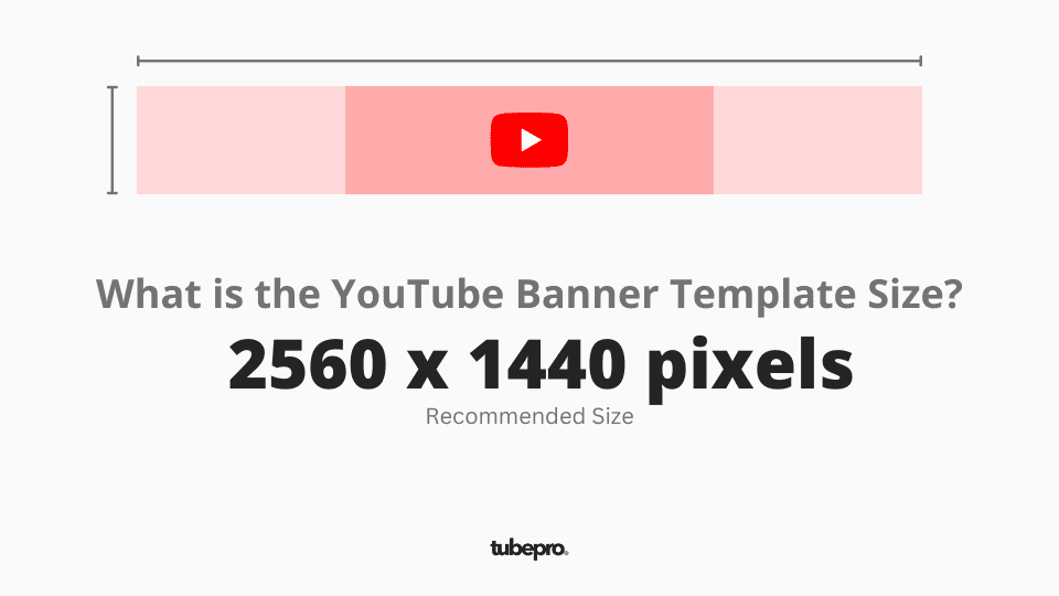
According to YouTube guidelines, you have four different sizes. This happens because your channel art will be displayed on different devices, such as desktops, tablets, smartphones, and TV’s.
So knowing this, you would want your YouTube banner to look great whether it’s displayed on a large screen 4K TV or the smallest screen on a smartphone.
But let’s go straight to the banner size. YouTube mentions:
YouTube Banner Template Guidelines
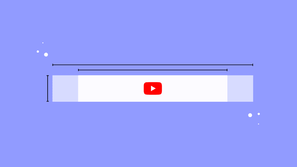
Here’s a visual guide to YouTube banner dimensions to help you better understand these guidelines.

To ensure that your YouTube banner is viewed in the best way possible, you’ll want to understand your “safe area.” If you’re not familiar with this term, your “safe area” is the minimum area you need to ensure your banner displays correctly, as you can see in the picture above.
Make sure that any important graphics or information about your brand that’s in the YouTube banner is completely within the safe area of 1235 x 338 pixels. This is very important, because if your viewers want to know about your channel, and your information is outside the safe area, then they won’t be able to see it properly.
Free YouTube Banner Template
Since I know that creating and managing a YouTube channel, or several, isn’t easy, and challenging most of the time, I created a simple and easy YouTube banner template that you can use for free. And here is one with transparent background.
You can use the PSD version (Adobe Photoshop), or the PNG version, which you can add to any other tool you may use. You just need to add the template and add your content above and inside the safe lines. Download it here.
Here is an example if you use Canva:
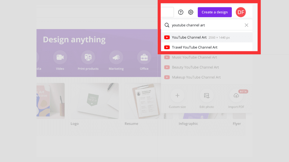
Go to Canva Home page, then click “Create a design” in the top right corner. Write “Youtube channel art”, and click the first option.
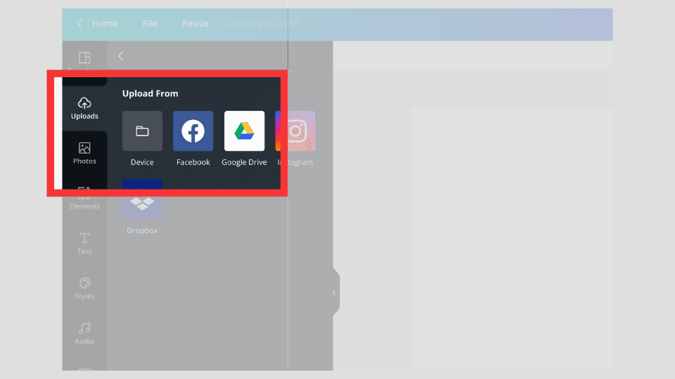
Then, on the left column, click “Upload”, and find the YouTube Banner Template you downloaded here at TubePro.
Add the banner template to the white canvas.
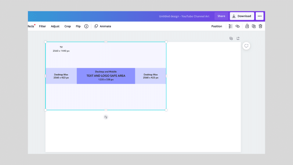
Expand the template to its full width.

Then, low the opacity to 30%.

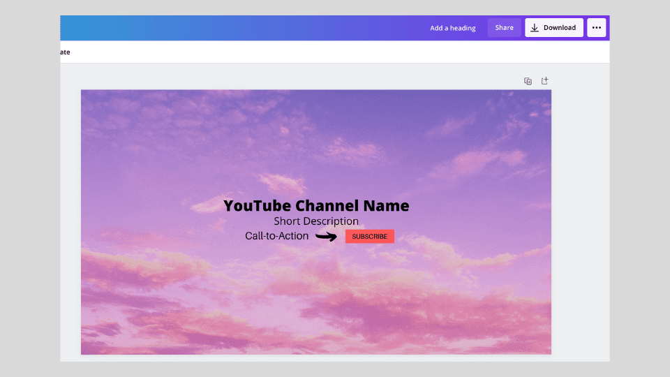
Choose the elements you want to include in the banner, for instance, channel name, description and/or call-to-action.

Finally, you can add a background if you want, to make your YouTube banner look great on every device. Download the file, and it’s done.
Best Practices When Creating Your YouTube Banner
If you want to draw people’s attention to your channel, using your YouTube banner, then size it’s only the first step. You’ll want to follow some good practices when creating a banner.
Dimensions
As I mentioned before, you can use Canva to create your YouTube banner through the template you downloaded. This matters why? Because if you use, for instance, an image too big, maybe parts of it will be cut off. If your text or logo stays outside the recommended safe area, important information will be lost when your channel is viewed on mobile.
So make sure you use the template to make it easy for you to perfect the placement of your logo or any text.
Less (text) is more
One of the main reasons you would want to minimize your text is so that it fits within the safe area.
Many successful YouTube channels only include the channel name, and nothing else.

You can also include a short description or tagline explaining what your channel is about.

Brand colors
If you already have an established community on other platforms, then you probably have a set of brand colors you use often.
This will help viewers identify the channel as belonging to your company.
You can also use this method when creating YouTube thumbnails.
Call-to-Action
If you have a YouTube channel, then chances are that you want to interact with your audience, in some way. Doesn’t matter if it’s to watch another video, subscribe to your channel or buy one of your products.
You can add a CTA (call-to-action), with powerful graphics that shows what your channel is all about.
Your CTA should be based on your end goal for your YouTube channel. For instance, if your channel is about tutorials and you want to gain more subscribers, then you would want to ask your viewers to “Subscribe for more Tutorials”.
YouTube Studio allows you to add a bar with links on your channel home page. These links can be redirected to other social media profiles, product pages, or your website.
If your end goal is to sell products or services, then your CTA should direct people to click on those links.
Whatever CTA you choose, make sure it stays inside the safe area of your YouTube banner.
YouTube Banner Maker
As I mentioned before, you can use your current way of creating a banner, or if you’re interested in starting fresh, then you can consider using one of the options below:
Canva

I’ve been using Canva for quite some time, to my surprise. Why am I saying this?
Because I’ve used Adobe Photoshop for as long as I remember to create this kind of graphic art.
But why do I find Canva better?
Well, because its practical and easy to use. For instance, when I need a certain element, like an icon, an object or an illustration, Canva has thousands of ready-to-use elements right there on the browser.
I don’t need to search the web, and then download, and upload it to Photoshop. Then finding that I would need to go search for another because the first one didn’t match the content.
I do have to say that you can use all of the elements with Canva Pro plan.
If you want to try it out, here’s a link to it (Disclaimer: I receive a small percentage if you decide to subscribe to Canva Pro): Click here
Crello

Crello is very similar to Canva, also with a free plan where you can create all the thumbnails you need by simply using the thousands of graphic elements available.
Visme

Visme is a graphic design creator with a free and paid version. It has professionally designed templates and icons you can use to create great thumbnails.
How to Upload a YouTube Banner
Now that you have a better understanding of how to create an effective YouTube banner for your channel, let’s go through the process of uploading it:
Conclusions
Using the best YouTube banner size is crucial, but it’s only the first step to have a successful and effective channel art.
You should make a banner that draws viewers into your channel by following the guidelines above, such as, keeping your elements inside the safe area, use your brand colors, keep the text to a minimum and use a CTA.
At the end of the day, your channel’s banner image is just a branding tool. Use it right.


